
.png)
.png)
.png)


Conquering the US Market
WeShip Express is the trusted provider of shipping, fulfillment, and storage solutions, specializing in alcohol beverages.
With over 20 years of industry experience, their comprehensive logistics solutions cater to a wide range of commodities, but our expertise in alcohol shipping sets us apart.
Where they started?
Where they want to go?

Where they started?
WeShip has enough Market Share in wine shipping and fulfillment service in the US. They provide 3 distinctive services — 800Ship // Label Direct // Fulfillment.
The company was doing okay in introducing these services to their customers but it was not enough.
Where they want to go?
WeShip wanted to introduce their 3 service offers to the world. They want to start with refreshing their branding and then do an intense marketing around the offers until they reach their goals.
Their goal is to conquer 90% of the US Market in wine shipping and fulfillment services at the end of 2026.


What’s holding them from getting there?
WeShip’s services and offers were top notch but they were having hard time communicating these offers to their customers.
They didn’t have high perceived value & a great first impression due to a lack of proper brand identity design. They didn’t have a Well-thought Sales Deck where they could easily explain their offers.
Their brand & visual identity was holding them back. They needed to do a rebrand to:
Increase their Perceived Value
Increase Marketing Effectiveness
Differentiate their brand from Competitors And
And build Credibility & Trust
Looking at their current visual & overall brand in depth


We decided to keep the logo concept & refine the typeface...


Building Credibility & Trust in every interaction using identity design
Now that we have our new logo, we can build the brand identity design & system that elevates the brand experience at every touch points, here are some of the things we have done:
B. Typography
C. Icon Design
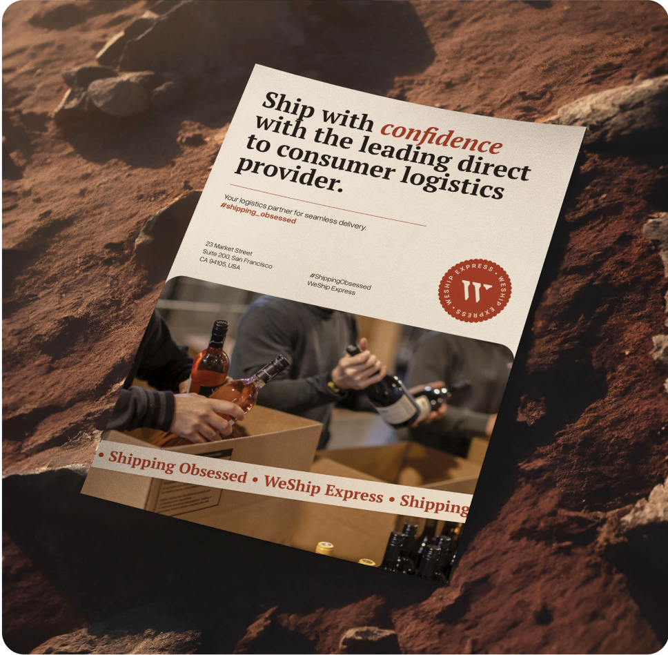
E. Sale Deck


We went on to refine the color palette. Aiming to enhance the brand’s visual identity, whose foundation remains rooted in deep, earthy tones that have symbolized WeShip’s stability in alcohol logistics. The aim was to strengthen the brand’s character while maintaining recognition.

Typography is the voice of the brand. The rationale was to select a font that resonated with the wordmark, PT Serif, and boldly use that as a display. Overused Grotesk, the body font, has just the right amount of personality to keep the typography engaging without overwhelming

The icons distill each service into a clear, functional symbol. 800Ship radiates expansion, Label Direct reflects precision, and Fulfillment stacks efficiency. Simple, intuitive, and unmistakably WeShip.

We then created the brand guidelines to give WeShip clarity, consistency, and impact across all touchpoints. This acts more than just a guide, it’s a blueprint for how WeShip presents itself; clear, confident, and built to last.
.webp)

“Perkk™ completely transformed our brand! We came to them feeling stuck with an identity that didn’t reflect our growth. Their rebranding process was seamless, strategic, and fast. They understood our vision and delivered an impressive brand identity that can help us grow.
The results? Increased confidence, stronger market positioning, and a brand we’re proud to show off. If you need a rebrand done right, Perkk™ is the team to trust!”


The sales deck became a proving ground for WeShip’s brand identity in action. With a clear design logic and thought-out execution, we designed a deck that showcases how strong branding elevates and works on every touchpoint.
Unleashing Innovation and Reliability in the Shipping Industry
WeShip has achieved significant milestones in their goal, which is acquiring huge market share in the US Market. They have emerged as the leading wine shipping and fulfillment company in the US.
They are pushing forward now towards conquering 90% of the Market Share, and they feel like they are on track.
A Special Thanks to the WeShip Team, particularly Bri Dorr, Marc Goodfriend, and Deb Witter for collaborating on the project.


.png)

